OM# Documentation
Interface Boxes
Interface boxes facilitate the interaction with visual programs, either for selecting/setting input or intermediate values, to trigger actions or to control the computation flow. They usually (but not necessarily) work along with reactive visual programs: user actions on interface boxes trigger notifications to downstream reactive connections.
Actions on the interface boxes can be performed by mouse clicks/mouse drag using the ⌘ (MacOS) or shift + Ctrl (Windows, Linux) keys. They can also be performed with simple mouse clicks and drags (without a modifier key) when the patch is locked.
Each interface box has different characteristics that can be set either trough a set of optional “box-attributes” inputs, or via the inspector panel.
Sliders
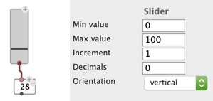
The slider box provides a convenient way to pick a value withing a given range.
Minimum value, maximum value, increment and number of decimals, as well as the orientation of the slider (:vertical or :horizontal) can be set from the inspector panel or using the optional “box attribute” inputs of the slider box.
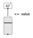
The current value can also be set using the value input.
Number box
A simple value box containing a number (integer or flat) is automatically turned into an interactive number box, whose value can be changed by dragging up or down with the mouse (and either Ctrl/⌘, or patch locked). Each value change triggers downstream reactive updates.
Note box
The
NOTEobject box is also considered an interface box, as its value can be set and modified using a simple click and/or dragging up and down with the mouse (and either Ctrl/⌘, or patch locked). Each value change triggers downstream reactive updates.
Check-box
The check-box simply returns T or NIL depending on whether it is checked or not, and can be checked/unchecked with a simple click.
Button
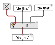
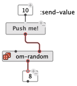
The button box allows triggering the execution of visual programs with a mouse-click interface.
By default, the value of the box is NIL, and becomes T when the button is clicked.
It can be decorated with a text, ans assigned a specific send-value that is set instead of T, and pushed to the output when the button is pressed.
Switch
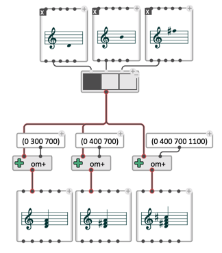
The switch box provides a simple interface to select between different value to connect somewhere, avoiding the need to disconnect/reconnect the corresponding outputs.
The box can be added as many inputs as desired, and displays corresponding boxes that can be clicked to select one of the inputs.
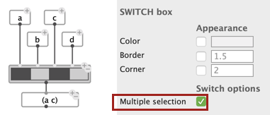
The multiple-selection attribute can be set from the inspector panel. In multiple selection, switch evaluates to the list of selected inputs.
List selection
The list-selection box displays and allows selecting one or more items from a list of choices.
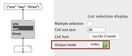
The size and font of the list cells can be set from the inspector panel, as a multiple-selection option, and an output-mode.
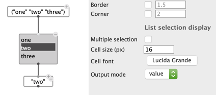
Items are selected/deselected by clicking on the corresponding row of the list.
If multiple-selection is on, several items can be selected at a time, and returned as a list from the list-selection box output.
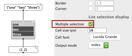
The output-mode determines whether the output should contain the value, or the index (starting with 0) of the selected item in the list.
List menu
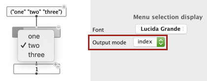
The list-menu box has a similar purpose as list-selection, but displays the the list of choices as a drop-down menu.
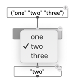
The output-mode also determines whether the output should contain the value, or the index (starting with 0) of the selected item in the list.
